Valuable Design Principals to Beautify Your Home Today

How to Select the Right Colors for your Room
June 8, 2020How to Create the Ultimate Home Office for YOU
June 21, 2020Have an “eye” for decorating? Many don’t, but if you apply these simple techniques, you will be able to decorate like a designer.
Remember this about design, it is personal, subjective, and should reflect your preferences and personality! Make it fun, homey, and eclectic. It can be traditional or contemporary. The main thing it makes YOU happy.
Take your preferences, apply these 6 design tricks to make your house a home.
1) Determine the Focal Points. The focal points are the eye-catching, dominant features in a room. These points of emphasis can be 1) Architectural, such as a fireplace, oversized window, or a tray ceiling; a built-in feature.
Or, 2) Created by the Designer, features that are created by the designer to add emphasis or interesting flow to a room. Consider these designer additions to add an element of interest that capture the viewer’s attention.
A-Contrast. We are drawn to spots of high contrast. For example, in a neutral space, a brightly colored art piece over a sofa will draw your eye. A room devoid of any pattern, a patterned rug or pillow will become a point of interest.
B- Position. Placing a point of emphasis where you first enter a room is a logical location for a focal point. Consider such pieces as a sofa table or by positioning the furniture, as a whole, to catch your eye or directing you toward the focal point.
C- Lighting. We are naturally drawn to bight areas in a room. Highlighting a painting, sculpture, or group of furniture with accent lighting, will allow these things to become focal points.
D- Size. Another designer created focal point is by including items that stand out because of their mass or volume. A great example would be to have a grand piano in the room. Over sized vases or wall art will accomplish this too.
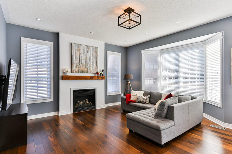
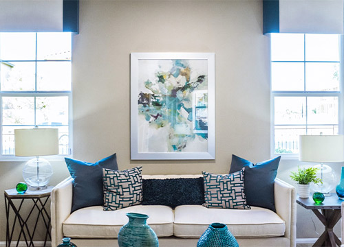
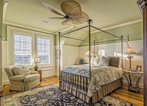
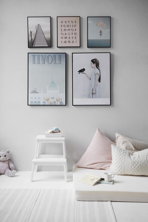
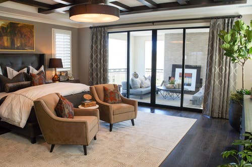
Take a look at these photos.
Can you pick out the designer created focal points?
2) Balance. Balance in terms of a design element indicates a steadiness and equality of design, without any, one area being too dominant. To achieve this balance is by using equal weight, by actual or visual.
A- Symmetrical. So, if you have a large sectional sofa along one side of a room, to balance that you will need to have equal weight on the other side. This might be a fireplace/mantel architectural feature or a bookcase/entertainment center. This could also apply to having the same lamp at either end of a sofa table or mantel. Smaller pieces require the same consideration to attain a pleasing balance and flow.
B- Asymmetrical. Picture a wall, place a group of 3 pictures on the wall. On the left is a large, colorful framed art piece and on the right are 2 smaller pieces –the 2 balance the one in visual mass. You created a balance but not with 2 equal size items like above. To accomplish this you need to use odd numbers, 3, 5, or even more, as you get practice building these groups.
C- Radial. This method of creating balance starts with a central focal point with elements radiating from or around it. You see this with a pendant light that has points radiating out from the center or a dining table that has chairs around it.
Balance is all about creating a design that is pleasing to the eye. Other items you will incorporate are shapes, color, pattern and texture. Every detail can help you achieve balance.
3) Design by rhythm. You want to give your space a nice, smooth flow; allowing your eye to glide around the room. This flow is created by employing the principle of rhythm. There are 5 types of rhythm and most rooms will utilize more than one.
A- Repetition. This type of design is very common and easy to achieve. This sense of rhythm is created by repeating elements in a balanced manner by using color, texture, shape, and motif. A repeat of these elements can be incorporated throughout the space.
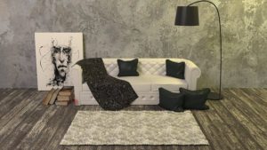
B- Opposition. This seems counter-intuitive to trying to create a rhythm but, abrupt changes in design create movement. High contrast, such as using black and white, square against a round, creating 90-degree angles, or placing a patterned design against solid piece all promote opposition rhythm.
Opposition design employing black and white and pattern against solid
C- Progression. This design technique is sometimes called gradation. Simply, meaning that there is a gradual change in design. The slow changes can be in size- from small to large- or in a color change. So, for example, you can have 3 pillows on the sofa and each is a different size, layered next to each other. Notice, in the above photo, that the wall color has a gradual change.
D- Transition. This style of rhythm is when the eye moves through the room in an uninterrupted manner. It often is in the form of a continuous, linear architectural detail, such as a molding along the ceiling, chair rail molding, or a wallpaper border.
E- Radiation. This is the design element that is very balanced and repeated. This could be a round table with chairs “radiating” around it with a round pendant light centered above the setting. On a wall, this could be a collage of round mirrors in various sizes.
4) Proportion Design Element. This refers to the relationship in size between design elements. Proportion can influence the interior greatly. It can be pleasing or unpleasing, naturally, we want to push for a pleasing result.
Throughout history, different civilizations have developed theories on creating and evaluating proportion. The ancient Greeks used a mathematical formula referred to as the golden rectangle. The relation of the length of a rectangle to its width is a ratio of 2:3. This size relationship proved to be aesthetically pleasing and is still used today.
The Renaissance period developed buildings using geometric shapes, starting with the square. They adopted the golden rectangle rule and developed additional pleasing relationships. The determined, proportionately, circles related to squares and ovals to rectangles. Developments on proportion grew to include relationships for diameter, height, and spacing. Interior relationships centered around proportions to the human body.
This element is more technical than most of what we look at to design a space. But, just the 2:3 rule can help when you think about putting groups together. Take a group of 3 bottles, when you select them according to this theory, you want your largest bottle to be 12″ tall. So what sizes will be the most pleasing to place with it. A 9″ bottle is the first to consider. If it is fatter than the first you should consider a little shorter bottle, to get your width to height ratio factored in. The 3rd bottle needs to be measured by the same factors.
5) Scale in Interior Design. Scale and proportion seem like the same thing but there is one small distinction between them. Scale deals with human scale when discussed in reference to interior design. It is the comparison of objects where the actual size of 1 of the objects is known. So scale is more absolute. So, instead of the 2:3 ratio to compare any 2 objects, this is in reference to us. The height of a table or counter top is standardized. A chair is scaled for a human. This applies to door heights, the width of a hallway, or the length of a bed.
6) Harmony in Design. This principle involves employing all the other factors and creating a cohesive, well-designed room. You create harmony through unity and variety.
A- Unity. This refers to the wholeness of the room, where some items or elements give the space a cohesiveness. You can use a uniform color theme, similar furniture styles, or with furniture that reflects conformity with the architecture. All of these factors can be used to unify a room.
B-Variety. A harmonious room with definitely have variety or it will be boring and appear flat. You can create harmony through contrast, contrasting colors, contrasting textures or shapes. You create variety with the furniture arrangement, angles, spacing.
Interior design is about the layering of the principals of design to develop a pleasing space. As you arrange your space ask yourself these questions:
*Is my design balanced in weight and color?
*Do I have at least one focal point in the room?
*Are the parts of the room in good proportional relationship to each other and the room as a whole?
*Do I have rhythm in the space? What makes my eye move through the room?
*Is it harmonious? Do I have both unity and variety?
I know that it seems like a lot to remember to make a room feel cohesive and put together. All of these principles layer over each other. Start with your emphasis in the space and work your way from there. Determine your style or theme and select colors that will help you enhance that. Start with the bigger pieces and then you will be able to see what you need to fill in for accessories to create your rhythm, balance, and proportion. Take it a step at a time. Step back after some progress and see what you think. Answer the questions above. Refer to the 6 principles. If you feel you can not get it to come together, hire a professional. In the end, you want to be happy in your home. Do what it takes for that!

